Wednesday, 27 October 2010

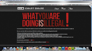
Download Page

I am just adding the finishing touches to my website and have managed to complete the download page. This is the place people will be taken to when they think they are downloading content. I kept with the same layout but I decided to change the background and text colours to make it obvious that it has much different content. I was able to change the text and background colour's by accessing a different stylesheet. I also included a big bold heading so people have an instant message which it is impossible to ignore.

The page can be seen below;

Monday, 25 October 2010

Piracy so far...

I have just uploaded my piracy project so far. None of the download links are working yet as I have not fully completed coding the warning page, and also the secret page isn't fully completed so the link in the top right corner won't open.

However, all of the jQuery is working and can be seen in action at;

http://www.gsdesignuk.com/piracy

Monday, 18 October 2010

Chart Share Coding

The coding of my website is coming along nicely. I have finished the home, music, and film pages and now just need to do the secret page and the warning page which will be opened once someone tries to download something.

I have managed to implement several different interactive elements throughout the site. The homepage features lots of different changes on mouse hovers and other events. Three of these can be seen below, along with the actual homepage. I think it has come together nicely after my design and I feel it has progressed well.


Design For Chart Share Site

Here is my chosen design for Chart Share. I like to experiment when it comes to layout and features of the website and I tend to do this whilst coding, therefore it may look slightly empty now but when I add in JavaScript and other things it will become much more interactive. I have tried to play around with using lots of bright colours and strong textures to make people almost want to touch the web page.

The question mark in the top right corner will have JQuery attached to it which makes it look as if the page is folding over, this will uncover the link to the secret page. This link is aimed at people who bothered to properly look around the site before just trying to download something straight away.

The four boxes at the top will be recommended downloads and will be pictures of certain song or film covers. There will also be a box which appears when you hover over a film name displaying a small synopsis of the film, this is done to make the site even more believable.

I decided to use 'Georgia' as my font, this is to show I am aware of current web trends as it was voted in the November 2010 issue of .net magazine as the 'best font for the web'.

Colour Scheme

Below are the colour schemes I made when deciding which colours to use in the design of my website. I usually do these so I can see how the colours look next to each other and it makes it easier for me to choose which would look best for that particular project. In this case I chose the one on the left as I felt it was a bit more eye catching without being to full on.

Chart Share Logo

The name of my fictional download company is Chart Share. This is a fictional company and therefore I have full creative license over the logo and corporate identity of the business. I decided to incorporate a pause, play, and stop sign in the logo as these are all things which can be applied to films and music. The finished logo can be seen below;

Wednesday, 6 October 2010

Simulated Client Project

Having been thinking about my simulated client project since we received the brief on Monday, I have decided on how I will approach the project. Rather than create a normal informative website about piracy I wanted to make people aware of the dangers in a more interesting way. I have therefore decided to create a site which is set out like one offering you free downloads of chart films and songs. The website will contain lists of current chat items which have a download link next to them, however, rather than actually downloading a film or song, it will download a pdf file which contains information about the dangers of piracy and illegal downloading.

After reading the assessment criteria for the project I feel I can match each one at a high end with such an idea. I will be able to demonstrate my knowledge of the current industry but applying an interesting design to the website which fits in with the current trend of web 2.0 sites with lots of texture and attention to detail on background images and text. I will also be able to show my knowledge of typography by using different styles in an effective way. I may also be able to incorporate video and sound into the website to make it look more authentic. I may possibly decide to experiment with HTML5 and CSS3 also.

The research I conduct on the dangers of piracy will be easily incorporated into downloaded file and I will also be able to make this look very relevant to the current industry, once again through the use of texture and typography.

Tuesday, 21 September 2010

Back Again!

I am back hard at work after a nice summer. I have undertaken a few client projects which have been somewhat of a farse and I am now concentrating on my own website which currently looks like this;


I am really happy with the look of the site and it contains some nice functionality which I have developed with thanks to my favourite web design guru, Soh Tanaka, (www.sohtanaka.com) without his tutorials my site would be rather empty.

I also wanted to share with you my new favourite website 'Dribbble', it is described as a 'show and tell for designers in 120,000 pixels or less' and this is exactly what it is. There is some really inspirational work on there and its great to waste time on just looking around!

Wednesday, 3 March 2010

Second Project


I have done a few designs for the second project which will be a website for my cousins band.
The above image is my favourite of the designs and will feature as the header for the website if I decide to use that design.

I have tried to modernise their look and use lots of grey and black with splashes of colour which highlight particular areas of the site.

This will be the header for several of the pages. I have also decided one of my flash elements will be a full page animated flash linking the user to the different areas of the site.

Friday, 19 February 2010

Brief Two


For the second project I will be using my cousins band as my client. They are a local band called Late of the Pier and are signed to the major record label Parlophone, along with other well known artists such as The Beatles, Coldplay, and Kylie Minogue!

Their current website is very minimal and only consists of a music player which contains all the tracks from their first album. The only other items on the page are links to their MySpace, shop, and the sign-up form for their mailing list.

I personally don't feel the current website does the band justice, and does not fully showcase how innovative and exciting they are. I think this is currently a very important thing for a band as it's the first place potential fans will go when they hear about a band and if they are presented with an extremely minimal website with no news or any real relevant information then it is likely they will leave the website straight away. Therefore I plan to design a website which is exciting and grabs the users attention from the start. I also want it to be interactive and the most important thing for me is that their music is easily accessible.

It is an exciting project for me because it is within the family, yet has the potential to be an international website. If I do a good job it is likely my cousin will decide to swap the website for their current one and this could lead to more work for me.

Check out their music here; http://www.lateofthepier.com/

Friday, 5 February 2010

Things That Are Brown

Things That Are Brown are a small web design company based in Seattle, run by a husband and wife. They create really well layed out websites which are extremely effective and easy to use. Their own personal website very much sums up their style, and alot of the websites they have created follow a very similar layout.


It is very easy to navigate the website and the simple plain background means that attention is not distracted from the main body of information and people focus on what is important. A lot of the website has been created on Photoshop and then put together to creat a really neat and clean feel. They have also used different hover effects really well in order to create interesting links which are very easy to use. The website is also very informative without being boring and maintains a fun feel throughout which overall makes for a very happy web experience.

My favourite website from their portfolio is for the company MIX Online (http://visitmix.com/). That website looks like this;


This website is set out in a very similar way to the portfolio website of the company, but it still manages to become a completely different experience through the use of different colours and fonts. I really like the way they have used a very low-key light grey background and then put little splashes of colour in different places throughout the page. The page also has a nice feel to it, with everything being big and bold and it becomes obvious very quickly how to navigate through the website and what different things do. There are also several uses of really interesting graphic design in the page, particularly in the top right with the use of different coloured circles which overlap. Also a very heavy typography influence is apparent in the site, and some of the fonts used are very interesting but work really well together to create a nice and clean site.

The other sites designed by the company follow a very similar layout, with the links located in the top right corner and everything fitting together really nicely. They also use very plain backgrounds and little splashes of colour in different places to add a really nice design effect.

Thursday, 4 February 2010

Design Exercise 11

The three different platforms I have chosen are mobile phones, digital billboards, and tablet computers. I feel these are all extremely relevant at the moment, especially so soon after Apple announced its new iPad.

These three platforms are all varied in the length of time they have been around, but they are constantly bringing out new technological advancements which enhance the experience of the user and make the different platforms seem newer.

Mobile phones have been around for some time, but it is only recently that the capabilities of them have really become amazing. This is primarily down to touchscreen technology and 3G which allows the user to connect extremely easily with people all around the world. Touchscreen allows the user to have the world literally at their fingertips and gives a more interactive feeling to using a mobile phone, the most notable phone in this category is the iPhone.

Apple has its own dedicated 'App Store' which users can access through iTunes, or directly from their phone and it allows them to instantly get new applications which have different capabilities. Apps can be produced by anyone around the world, and these can then be added onto iTunes and then freely downloaded by anyone, obviously they are checked before they are added to the App Store else it would make it very easy for someone to hack into the system.

Overall the whole touchscreen interactive feel has really taken off and made millions of pounds for various companies around the world. It also has the capability to do some really interesting and experimental things through apps.

I personally feel digital billboards will be something which becomes more and more apparent over time. This is due to different enhancements in the quality of picture available through things like HD, and Blu-Ray. Another thing which I can see big companies taking advantage of is 3d. Last weekend saw several pubs around the UK show live football in 3d, this is the first time anything like that has happened and I feel it will become more and more popular. Companies will be able to bring in exciting and intriguing advertising campaigns which will attract more customers. This once again brings interactivity into the picture as people will feel as if they are within the advert.

Finally I can see more and more tablet computers being created to compete with the launch of Apple's iPad. The iPad is a huge release for the tech world, and although its first model has major flaws, such as no flash player, eventually it will become as popular as laptops. Once again through the touchscreen it adds even more interactivity and people feel as if they are interacting with something real. The iPad also uses the same App Store used by iPhones and this indicates that apps will become more and more popular and the store will continue to grow with thousands of people adding their own content. This could have a negative impact on a web designer and force me to change my practice. If people are doing everything through interactive apps, then it could be the end of the browser.

I think in one years time the major digital platform will be a combination of these three things. Phone technology is so good now people are able to access the internet and connect with people instantly. Also the recent screenings of 3d football games will happen more often and eventually, in a decade or so, everything we watch will be in 3d and allow the user to interact more.

Personally I don't think tablet technology will take off for a few years time as they are not yet able to do the same things a laptop can. However, once people can install programs onto a hand held tablet computer then it will become very popular and lots of people will be using them.

Overall these different technological advancements will mean I will have to be constantly moving forward as a practitioner. I will have to learn skills in lots of different software packages in order to keep up with the latest device.

Wednesday, 3 February 2010

Update

Been very busy these past few weeks with various different things. First of all are the two websites I am working on for the Peacock pub. I have been trying to experiment with my second design more and it hasn't really come out how I intended it to, but I still think it works fairly well.

Alongside this I have been working on the website I made for a family friend's business, this can be found at; http://www.germanauto.co.uk and it is now very close to completion.

I have also been working on my own personal website which I am very happy with so far. It isn't online yet, but it looks like this;

Thursday, 14 January 2010

Non Web Designer Three

Peter Saville
Peter Saville is a graphic designer from Manchester. He is most famous for creating record sleeves for Factory Records and has designed covers for such bands as Joy Division and New Order.

I have been a fan of Factory Records and the bands they employed for a long time and I was always intrigued by the interesting simplicity of the record covers. I then started to look into the design and that is where I discovered Saville. I then went on to look at his other work he did for the 'Hacienda' club in Manchester.

All of his designs are very simple but yet so effective, and this is a theme which has run through all of the other successful designers I have looked at. This is also something I can interpret in my own work.

My favorite bits of Saville's work are the posters he created to advertise the different nights which were happening at the Hacienda. They all followed a similar theme which contained big bold colours and stood out amongst other designs. This is definitely something which I could interpret in my work by using big bold colours to attract the users attention, but at the same time not overcrowding the page with many contrasting colours.


Wednesday, 13 January 2010

Non Web Designer Two

Shane Meadows (http://www.shanemeadows.co.uk/)
Shane Meadows is a director and screen writer from Uttoxeter. He has been my favourite director ever since I first saw the film 'Dead Man's Shoes'. The way he creates atmosphere within a film and really sets the scene for the audience is why I was mainly drawn to him, along with great storylines and scriptwriting.

I like the way he uses simple landscapes within his films, the kind of landscapes you look at and can straight away connect with as they are generally of commonly seen sights and areas. I can also relate to him on a personal level as he is from an area very close to me, and many of his films have been filmed where I live and some of my friends have also featured in these films.

He has won several awards for his films and achieved some success with the release of his most famous film 'This is England'.

I am inspired by Meadows on a daily basis, when I see things around me which look similar to the images portrayed in his films. I can take inspiration from the way he has stuck to his roots and is able to connect with so many different people through simple imagery.

Creating things which people can relate to gives you a much greater chance of achieving success and I can try to bring this across in my work. By creating imagery which people are familiar with and like my work will be spread across a more wide audience.

Friday, 8 January 2010

Non Web Designer One

Raf Simons (http://www.rafbyrafsimons.com/)
Raf Simons is a 41 year old fashion designer from Belgium. He is strictly a menswear designer and has his own brand of clothing, Raf by Raf Simons, as well as designing for other companies. I became aware of Raf when he did some work for Fred Perry.

Fred Perry is a clothing brand which I am a massive fan of, I have spent a lot of money on their clothes and own hundreds of items. Raf announced a collaboration with Fred Perry in 2008 and they bought out several garments, primarily knitwear, but also some more casual items. The collaboration was fairly successful, although all the items were priced towards the top end of the market.

Raf primarily appealed to me because he was designing for Fred Perry, but through this collaboration I discovered his other work. Despite the fact I probably wouldn't wear his own personal brand, I still admire the way he has really expressed his own identity through his clothing. After looking more into Raf's work I discovered his website, this also fits in extremely well with his identity as it is based on a white background with very few things shown on the screen at any one time. This works really well and keeps you focused on what is important on each page.

I am influenced by Raf in the way he is able to express himself through his practice. You can really see his identity in the clothes he designs. He keeps them simple and sharp, creating stylish items. I can apply this into websites I create by being very minimal and taking the approach that keeping it simple keeps it effective. I can also be influenced by the way he has used a lot of experimentation during his career, this can easily be done through web design by collaboration with people from different areas of design and multimedia.

Waterfall and Whirlpool Software Development Methods

The waterfall and whirlpool software development methods are very similar in what they do. They have both been designed in order to break down tasks for a project into smaller, more manageable pieces. This enables you to see each specific part of a project and will give you an idea of how many tasks you have left to do, much like a gantt chart.

The waterfall method is given its name as it looks like a waterfall, flowing downwards as you complete each phase of the project through the stages; requirements, analysis, design, build and testing. It is a very strict method, in the way you cannot begin the next task until the one you are currently working on has been fully completed. This means there is no room for error as you cannot go back to a previous section.

Whereas the whirlpool method flows round in a circle allowing you to go back to the start if required. This method allows the user to flow more, much like an actual whirlpool, and it gives you some freedom to work on different sections until you are completely happy with them.


The waterfall method is very straightforward and indicates that you work through each phase just once until it is completed. This is not very good for a web designer as it means you cannot go back to any of the previous sections in order to alter your work. This of course is a huge part of web design as it is important the client is happy.


The whirlpool method seems much more suited to web design as it allows the designer to go back to previous sections once a full circle has been completed. It allows you to constantly update and evaluate your design. This is good if you have a client as they may want you to update the website on a regular basis.


The Waterfall Method