My fourth artefact was designed to see whether certain website features which have only been available since the introduction of HTML5 and CSS3 have an effect on which sites people prefer to buy their music from. I mainly used the ability to bring in any font that you desire to alter the looks of the three sites. I asked people to look at the three example web pages and then answer six questions relating to them.
I am very happy with the design of my artefact. I managed to create three mock websites with the same content that looked completely different. I don’t really think there is any way I could change the design of them to improve the set of survey results I gained.
I had sufficient time to design three web pages well and then have 30+ people complete the survey. I feel I had the perfect amount of time to get the most out of this artefact.
For this artefact I just used Photoshop to create the mock websites, after compiling the results next time I will properly create a web page in HTML5 and CSS3 in order to give the user a more realistic feel to the site.
I feel I achieved a good set of results from the survey that will allow me to move forwards with my final two artefacts. People had fairly unanimous views that allowed me to collate my results nicely and gain some good responses. Many of them also said the usage of fonts within the sites affected their decisions on which to choose, this has led me to decide to explore the use of fonts within websites further in my next artefacts. They also said they would rather download songs than listen online, this makes it easier for me to progress with my artefacts.

Wednesday, 20 April 2011
Thursday, 14 April 2011
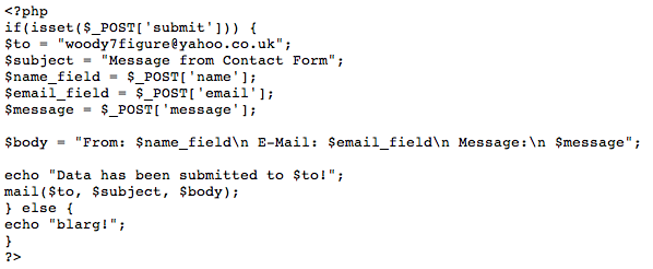
PHP Problem
I had another problem when creating the contact form for the Bluebell webpage. When data was filled out into the form and the send button was pressed, rather than sending it to the correct address and redirecting to the 'message sent' page, a page with the PHP which sends the message appeared;

I felt it must have been a small problem with the HTML of the contact page as I could see the PHP was all correct. It took me while to find it but I had made a small error in the HTML for the form and had entered an incorrect value for the 'class' section. I corrected it to this;

The contact form now works fine.
Client Problem
One problem I had when creating my clients website was with the width of the footer. It was set to 100% as you can see below;

However, even though the width meant it should go across the whole page, it didn't and left gaps to the side and bottom;

I had a play around with different ideas and eventually worked out that the default setting for Dreamweaver pages was to have a small, 10px gap around the edge of the webpage. I therefore needed to remove this gap through using the CSS 'body' tag. I added this section of code;

And after doing that the border has been removed and it now displays correctly;

Wednesday, 13 April 2011
Artefact 4 Results
My fourth artefact was designed to see if certain HTML5 and CSS3 elements, such as being able to use any font, effected peoples decisions on where they would rather buy from. I made a page featuring three different website designs and asked people to look at them and then answer 6 questions, here are the results;
1. Would you rather buy from site 1, 2, or 3, and why?
3, it looks the most stylish and cool.
3 because it is very clear to use.
3 More professional looking
3 - 1 is too dark and boring and doesn't necessarily convey what the website is trying to do. 2 is too amateur and childlike, the 3rd is much more professional and easier to navigate. Nice use of graphics with the 'pause, play' etc.
I would rather buy from site number 1 because it tells you exactly what the website is for unlike site 3 and the font is easier to read than the 2nd site.
3. Font is the sickest. Colour scheme is nice. It just generally looks quality.
3. Is clearer and text is easier to read.
3. Plain and simple
Site 3 I like the buy now function and the description next to the number one
3. Nicest layout and prefer the font.
3 best layout. 1. looks like it has the stylings of a marijuana paraphanalia website 2. looks like a chewing gum packet 3. looks smart and is the best
3 - I think in looks a lot more professional and modern
3 - It looks more professional and more aesthetically pleasing. The fonts are easier to read. I feel it uses space more effectively that the others.
3 clear font, looks more interactive and provides more information.
2, easy to read and looks easy to use
3 - Looks more official which i believe is down to the neutral colours used.
3 - its looks more professional and the text is easy to read. The font used on 1 and 2 was hard to read.
Site 3 as it is clear and has the simple colouring of black text on grey with a clear buy now button like you would see on itunes!
3 - looks more professional and gives more information.
2. Given the choice, would you rather be able to save songs as favourites so you can listen many times online, or download a song so you could have it on a personal music player to listen to whenever?

3. If the pictures were really fully functioning web pages, which do you think would be the most user friendly?

4. Briefly, if you had the chance to create your own music download site, what features would you include?
Create my own playlists to listen to each time I visit
play online download mp3 download the video favourite
artist profiles and background info see gigs they are doing
A feature similar to Itunes genius - recommended music related to whatever the person has downloaded so far. Also the option to browse by genre.
a top 10 chart and the prices of the songs
To be honest I can't really think of anything that isn't featured on these sites. Maybe a free album artwork updater?
Recommendations
'Trending' type feature split into genre's to highlight album tracks that are listened to a lot that might be missed due to lack of commercial promotion
lyrics, song recommendation
Have a genre filter and a new music recommended to you section
A listen before you buy option, some artist info including some art work and also suggested artists relating to your previous purchases. Basically Itunes.
images, songs, artist description
recommendations , facebook link, high quality MP3 format, large music catalog.
Song previews, videos, artist biographies, charts, playlists
a suggestions app to analyze your previous purchases and recommend new music. A social element where you can add friends and see their purchases and favourites.
send music to your phone create playlist of most popular music
Youtube clips of the songs/ Videos, A member log in, Paypal/ Payment options, Blogs, News Feeds, Clubs, Quick downloads.
Previews of videos/songs.
smart playlists giving you songs similar to your own choices. Ready made playlists for specialised genres.
free single of the week like iTunes. suggestions of music in the same genre you may like to download.
5. Would you be happy to use and download from all three of the sites?

6. Did the usage of different fonts within the pages affect your decision on which was your favourite?

Inspiration
I stumbled across the website for the restaurant chain 'Giraffe' and found it quite inspiring. It gave me ideas for different elements which I would like to include in the Bluebell site. I like how they have integrated the Twitter feed in an interesting way at the top of the page, I feel I have achieved something similar with my site and feel it is as exciting to look at. The website can be seen below;

Giraffe
I have also implemented a similar slideshow on my homepage, however they haven't used actual pictures, just offers. Since seeing this I have now decided to include a slideshow on the menu page which features offers rather than pictures of the restaurant.
They also have a nice feature on their menu page where a tooltip appears with a picture of the particular food you hover over on the menu, I will be implementing a similar thing on the Bluebell website.

They have also included lots of different image changes on hover, this really adds interactivity to the website without becoming too complex, I will try an incorporate many of these within the Bluebell site.
Alignment Problem
Another problem I had when creating my website was on the Location page. I have a large map which is embedded from Google Maps, to the right of this is a box with the address and a link to the website of the sister pub.
When I first embedded the the map it moved the box on the right down for no apparent reason, it looked like this;

I played around with different bits of code to try and align it correctly again, as well as putting it into a container div box. I knew that the margin property was used to move that particular element away from one surrounding it from either/all of the top, left, right, or bottom. I wasn't however aware that by using '-' you could move the div closer to another div. This is done with;

Having found the correct amount of pixels to move the div up by, I have now aligned it properly. Simply using 'margin-bottom' would not work for this as it would leave empty space below and extend the page. It now looks like this;

Active Navigation State
The navigation for my client site contains a different 'state' for whichever page is currently selected. As far as I could see there are two ways of doing this, one with CSS, and one with different images. The different 'state' looks like this;

The first, and more complex, way of achieving this look would be with CSS. To attempt this way I followed a tutorial online which states 'CSS Sprites' would have to be used. This is where one image would contain the three states of each navigation item, these are default, hover, and active. It would look something like this;

Using this with some clever CSS;
/*--CSS Sprites - Default State--*/
ul#topnav a {
float: left;
display: block;
height: 58px; /*--NAVIGATION HEIGHT--*/
text-indent: -99999px; /*--MOVES THE TEXT OFF THE PAGE--*/
background-position: left top;
}
/*--CSS Sprites - Hover State--*/
ul#topnav a:hover {
background-position: left -58px;
}
It gives the effect that the image is changing, when infact it is just moving up and down allowing different bits of the image to be shown.
The second way is alot more simple and just contains HTML and two separate images. One image of the default state, and one of the hover/active state. The HTML is as follows;

This just states on mouse over the image changes to the hover state, then when the mouse moves away again it goes back to the original image. It is then possible to create the appearance of the CSS method by just putting the hover state as the default image.
Monday, 11 April 2011
Client Twitter Integration
In order to keep up with the latest web trends I thought it was important that my client has good links with social networks. I wanted to incorporate a Twitter feed into their website, but in a more interesting way than just featuring 'tweets' at the side of the page in a big row. I came up with the idea of having a ribbon across the top of the page, above the navigation. I feel this breaks up the page nicely and looks really cool;

To call in the correct Twitter feed JavaScript is referenced at the bottom of each HTML page the feed is required on;

Where it says "/user_timeline/thebluebellinn.json" is where the Twitter username is referenced, this code can be applied to any Twitter feed and and in any HTML page. To stop multiple posts appearing the code "twitterCallback2&count=1" is used, where '1' can be changed to whichever number you choose.
The CSS for the feed is as follows;

It is very easy to customise and it wasn't too difficult for me to correctly align the text in the ribbon to make it look good. After this I have also used the same JavaScript to create a Twitter feed on my own website; http://www.georgewood.me and as you can see there is a massive difference in the way I have displayed the information, showing how customisable this bit of JavaScript is.
Subscribe to:
Comments (Atom)