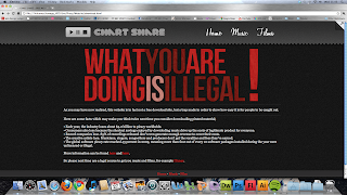
Here is my chosen design for Chart Share. I like to experiment when it comes to layout and features of the website and I tend to do this whilst coding, therefore it may look slightly empty now but when I add in JavaScript and other things it will become much more interactive. I have tried to play around with using lots of bright colours and strong textures to make people almost want to touch the web page.
The question mark in the top right corner will have JQuery attached to it which makes it look as if the page is folding over, this will uncover the link to the secret page. This link is aimed at people who bothered to properly look around the site before just trying to download something straight away.
The four boxes at the top will be recommended downloads and will be pictures of certain song or film covers. There will also be a box which appears when you hover over a film name displaying a small synopsis of the film, this is done to make the site even more believable.
I decided to use 'Georgia' as my font, this is to show I am aware of current web trends as it was voted in the November 2010 issue of .net magazine as the 'best font for the web'.


